Aleksandar Todorović
If you’re interested in creative exchange, sharing impressions or anything else, please do not hesitate to contact me.
If you’re interested in creative exchange, sharing impressions or anything else, please do not hesitate to contact me.
In Spring 2010 I quit living in the Western world and run off to the deep Russian East. I ended up living in an orthodox monastery called Kirillo-Belosersk, almost 1000 km north of Moscow. Being there for more than two months with monks and strict believers changed my point of the modern and civilized world. Besides the enlightenment, I also got the great opportunity to help reconstructing an old church from the 16th century.
During my studies in Düsseldorf, I started to work as a gofer at the graphic department of the biggest European broadcasting network in Cologne (Köln): the fabulous RTL. Some accuse it of its brainwashing qualities, others see it as the best gap filler between hard work at the assembly line and sleep.
To be honest, for me it was one of the most authentic experiences in the field of graphic design. And it was great! I’ve never been closer to an accumulation of mass media culture, the ultimate peak of almost every contemporary artist’s inspiration.
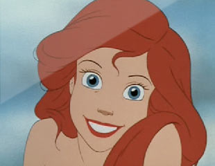
When I emigrated from collapsing Bosnia and Hercegovina to uniting Germany, this little cute red haired fish showed me how emotional, passionate, and self-sacrificing the Western World is. Dear Ariel, this spot is dedicated to you! Thank you for everything!
By the way, enjoy one of the best links on Youtube by clicking here!
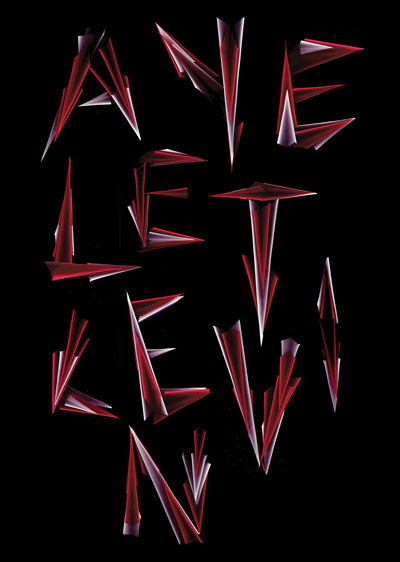
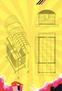
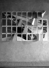
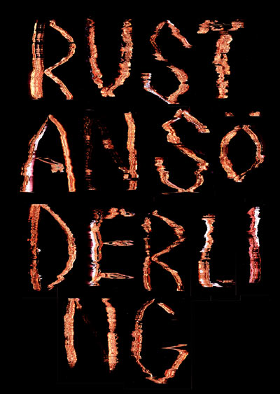
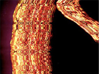
This is just a visual study (thus, no conceptual, profound or ideological approach). For the Open Day at the Rietveld Academie, each design student had to re-create one name from the graphic department. For this, we all were assigned one Photoshop filter, whose effect we then had to transform and work with in analogue reality. I was assigned the “lightning effects”.
To create the letters, I used different light-producing media like floodlight, cat’s eyes and a scanner. Here you see a typeface made out of scanned red and white paper cut outs.
Will Holder, a graphic designer from England, is not only extremely intelligent, he’s also an excellent fortune teller. Without telling us the aim, the procedure or the purpose of his workshop, he lead us towards expected and planned results, without interfering directly into our discussions.
Just by giving small hints, it was only a matter of time till someone proposed ideas which he had foreseen. The whole project was about simultaneous documentation of a specific happening.
At the end, we developed a method to simultaneously document the lecture series given in Gent, Belgium.
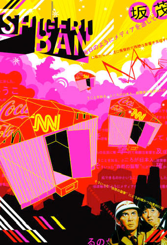
In Summer 2004, the Japanese architect Shigeru Ban came to Cologne to give a lecture about his famous emergency accommodations in disaster areas, which are made out of paper tubes. Later on I had an interview with him, which is documented in the first issue of RAKETE magazine, a students’ publication, designed at the Fh Düsseldorf.
This is the visual outcome:
a poster based on Japanese stereotypes — bright neon colors, lightning, monsters and threatened Japanese. At that point I was affected by trendy, superficial and hyped styles which were state of the art at that time. Fortunately, soon after that, I found enlightenment.
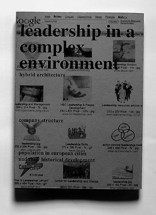
Once upon a time, (well, ca. 2005) almost any conceptual graphic designer was indescribably fascinated by the sudden overload of arbitrary images, listed in certain web search engines, like Yahoo, Lycos or Google. Therefore, it wasn’t a big surprise that web search engines’ aesthetics were used for several publications.
As you can see, I was influenced by the Google phenomena as well: Look at my small booklet with a Google cover and Google images about arbitrary images. Phew.
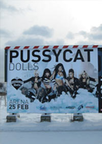
Don’t cha think I designed this poster. Don’t cha! But when I walked by the billboards for the recent Pussycat Dolls’ tour called World Domination Tour (superb title!) taking place in the great Arena of Belgrade, I had to stop and take a flick. On the poster you see them arriving on big motorbikes and producing a lot of dust.
Well, at first glance, there’s nothing special about it. But at closer examination, the picture reveals much more than you would expect. Believe me, such a poster wouldn’t have been imaginable at all in Belgrade a couple of years back ago. After years of war, crime and dictatorship, Serbia is still a country in permanent conflict between the overlapping West and the traditional affection for the East.
However, (and here it comes) there couldn’t be a better proof like the “invasion” of the Pussycat Dolls that Serbia is becoming an inherent part of the Western mass culture. If you want to westernize a country or you’re afraid of sceptic Eastern countries, just send them the Pussycat Dolls and they will do the rest. No wonder their tour is called World Domination Tour.
I have always been annoyed by the circuitous history documentation of all internet browsers. The only way you could browse through your history, were cryptical web links and if you were lucky, you could recognize a website by its favicon, only in case the page had one.
While I was playing around with Mac’s iPhoto application, I realized that this actually could be a great system for a web history. Icons, which are resizable, can display a certain amount of visited websites and create an easier overview. I came up with this idea in spring 2008. I guess, there’s such a thing already out there now, isn’t it?
I’d like to thank Luna Maurer, for being a great teacher and an inspiration. Cmok!
Due to the weird war in Bosnia, my family couldn’t go back to their homes anymore. In December 1994 we found someone who was in the same situation, but from the other side of the front, who was interested in switching houses.
Since then our new house, which is located in the small town Bijeljina, is supposed to be our new home. Unfortunately, not much renovation has been done, because my parents have lost any ambition or strength to re-built a new cosy home. The garden, the facade and the interior are still decaying. By the way, Bijeljina is situated in the North-East of Bosnia and can be considered as the dustiest cultural desert in Europe.
But now, it’s time for a change! Finally, I took matters into my own hands and created a plan for this useless block. It will be called SCAB, which means Space for Contemporary Art Bijeljina, and it will be transformed into a leading art institution in the Western Balkans. The SCAB will offer three totally empty floors (plus potential sculpture garden) for cultural happenings, social activities and arty discourses. It will be the perfect spot in Bosnia’s outback. Also, it has the potential to become a leading sanctuary for the overcivilizied and spoiled West.

Being a type nerd means loving to sit by yourself in libraries for hours, browse through dusty books and observe accurately shapes of sans serif, display or serif fonts. Also, while warming library chairs, a type nerd may come across a typeface which seems to be different, unknown, mysterious or which has been fallen into oblivion.
So the type nerd’s duty is to find out everything about the typeface and might consider digitizing it. In an ideal world, the typeface belonged to a bankrupt foundry, so there aren’t any problems with property rights.
For at least two months I was such a type nerd who found a quite interesting font called Continental Caledon, probably made between the industrial revolution and the beginning of the 20th century, somewhere in the UK. I digitized it and came across the successor foundry. They were interested in collaborating but due to the financial crisis they couldn’t offer me anything except an original film (which they found in their archives) as a present. At the end I didn’t agree and kept the font without using it even once.
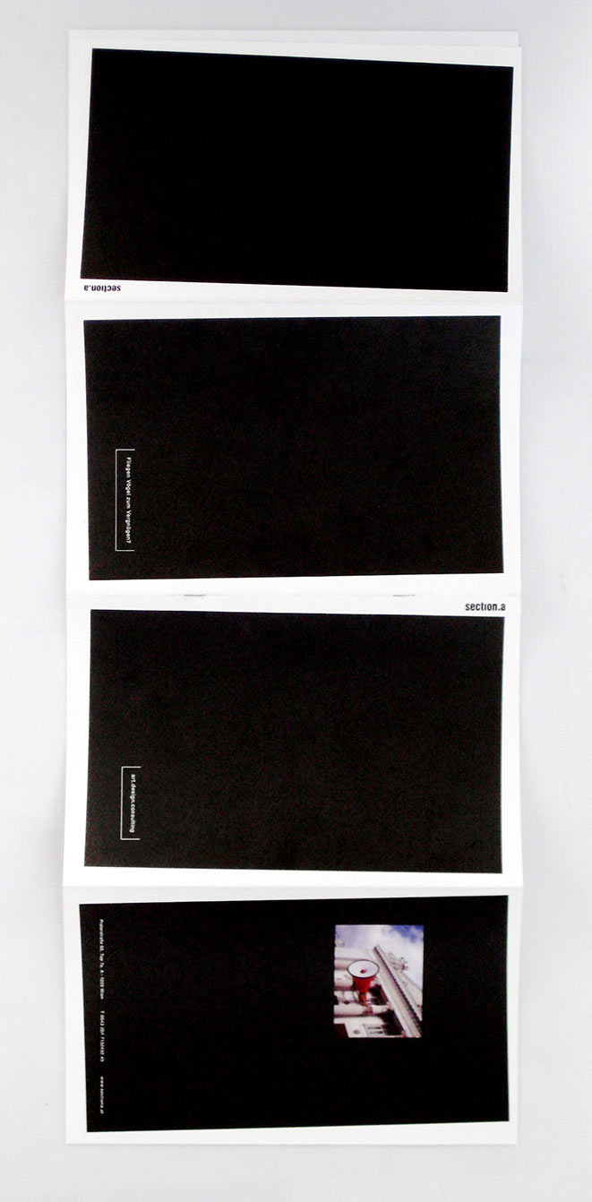
I was commissioned to create a visual concept for the portfolio of the Vienna-based art and design consulting agency section.a, who organized the Austrian Pavilion 2013 at the Venice Biennale amongst other projects mainly in Austria and Europe.
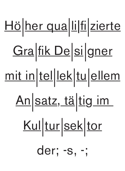
Der höher qualifzierte Grafik Designer mit intellektuellem Ansatz, tätig im Kultursektor, ist die Bezeichnung für einen zeitgenössischen Grafik Designer, dessen Visualisierungssprache sich hauptsächlich an vergangene Ideologien in der Kunst und dem Grafik Design [→Avantgarde, Moderne, Fluxus] anlehnt. Jedoch handelt es sich hierbei nicht um eine inhaltliche Weiterentwicklung bzw. Fortsetzung dieser Ideenwelten, sondern um eine rein visuelle (und somit oberflächliche) Bezugnahme. Auf den ersten Blick nicht erkennbar täuscht der kulturell ausgerichtete Grafik Designer meist ein direktes oder ernsteres Interesse an einer inhaltlichen Auseinandersetzung nur vor [→Egomanie, Selbstdarstellung, Facebook].
Die Assoziation Kultursektor im Zusammenhang mit Grafik Design wird oft als Aufwertung gesehen.
Die Verbreitungsgebiete solcher als besonders qualifiziert geltender Grafik Designer befinden sich hauptsächlich in kulturell stark ausgeprägten Ballungsräumen [→Berlin, Amsterdam, Paris], wo es zu hoher Konzentration kommen kann.
Hierbei teilt sich der Berufsstand in zwei Gruppen auf:
Gruppe Eins ist neben Arbeiten im kulturellen Sektor auch im niedriger qualifizierten Konsumsektor tätig, der aufgrund von Mangel an intellektuellem Ansatz oft kein hohes Ansehen genießt. Jedoch kann eine Tätigkeit im Konsumsektor meist nicht vermieden werden, da der Kultursektor praktisch als nicht rentabel bzw. selbstfinanzierbar gilt. Um einen unerwünschten Bezug zum Konsumsektor zu verhindern, verwenden solche höher qualifizierten Grafiker Pseudonyme und verzichten auf ihren Namen im Impressum.
Gruppe Zwei lehnt den Konsumsektor offiziell ab, hat gleichzeitig aber auch keine höhere Anerkennung oder Einkommen im Kultursektor. Der daraus resultierende Misserfolg führt zu einer ausgeprägten Identifizierung mit den Vertretern der oben genannten Ideologien [→Bohème, Selbstreferentialität]. Meist erhielten Künstler dieser Epochen erst nach vielen Jahren eine Anerkennung für ihre Leistungen und wurden erst im Nachhinein als “avantgarde” bezeichnet, welches Gruppe Zwei dazu verleitet, sich in ihrem Misserfolg als neuzeitliche Avantgardisten bestätigt zu fühlen. Der wesentliche Unterschied liegt jedoch im Umgang mit Grafik Design. Gruppe Zwei fällt eher durch das Auftreten auf Freizeitveranstaltungen wie Partys, Ausstellungs- & Galerieeröffnungen [→Berlin-Techno, zeitgenössisches Museum, Free-Drink] auf als durch eine intensive Auseinandersetzung mit der Profession.
I always wondered how Disney actors like Mickey, Tinkerbell or Ursula can really live their life's dreams within the script of commercial Disney movies. Well, we all have shitty day jobs to pay our bills, but I’m sure our colorful Disney friends also have secret dreams, to be part of serious contemporary dance, opera or modern theater one day.
Go on, show them some love and support, these wallpapers you can download here prove they could live up to their dream: Ursula in Verdi’s I Lombardi alla prima crociata, Micky and Minnie in Igor Strawinsky’s The Firebird Jasmine in Glen Tetley’s Le Sacre du Printemps and Tinkerbell in Brecht’s The Condemnation of Lucullus.
I was commissioned to create a visual concept for the website of the Berlin-based art and science magazine called Meta. Visit www.meta-magazine.com
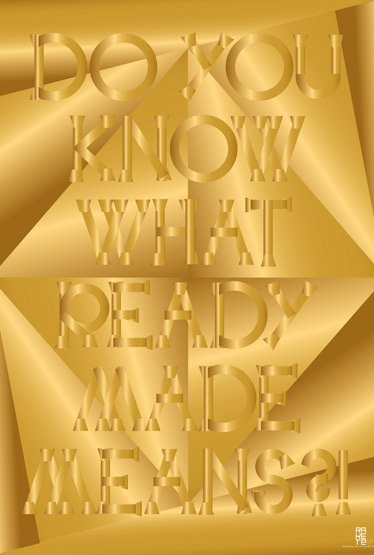
And once again, I was asked to design a poster for the recent issue of design magazine RAKETE from Düsseldorf. It was about a famous product designer, who’s the inventor of a new fancy technique to create new fancy and expensive products (called “ready mades”) shown in some glossy magazines made for pretty and stylish people. Being quite a bit annoyed by the massive hype that surrounds this guy (some magazines even compared him to Duchamps!!), I really didn’t feel like being a consequent graphic designer and translate the given content into a coherent, conclusive and interesting visualisation. To be honest, I couldn’t care less. Thus, I did something that I had always wanted to do: design a golden poster!
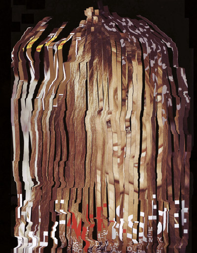
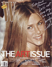
In Spring 2008, designer Bart de Baets held a workshop at the Gerrit Rietveld Academie. Everybody was invited to experiment with the Jennifer Aniston cover of W Magazine (The Art Issue).
My first version ended up as an accidental homage to Cousin It
(a character from The Addams Family).
Nein! Hier geht es nicht um die Form! Sondern um den Verfall (zur Formalität)! Und übrigens, die Dokumenta, dieses seltsame Etwas, das immer wieder in der Provinz stattfindet, weil es dort fernab vom Markt sei, und jämmerlich versucht avantgarde zu sein (Stand 1912), ist die Stiefmutter aller Formalitäten.
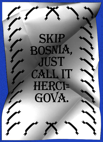
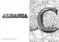
Once a Brazilian friend complimented on the name of my country of origin. She told me she liked the name Bosnia and Herzigova, and even suggested to skip the first part and only call it “Herzigova”. Unfortunately, she didn’t know that the second part is not identical with Czech supermodel’s name Eva Herzigova but is actually called “Bosnia and Herzegovina”.
Somehow I liked her light-headed and naive thought, especially when you consider all the reasons for the conflict-filled past of this small country in the South of Europe. Actually, all the conflicts resulted from desires to change existing political and religious symbols and names. My friend’s sweet suggestion gave me the reason to play around with the heaviness and importance of a country’s name.
Another two posters which are also listed somewhere on this website, evolved from this project.
This is not exactly my own work. It is made by my Alter Ego, called Ilija van Doengen-Blitz.
While most graphic design seems to be obsessed with glamour, van Doengen-Blitz’s work is conceptual and political. He’s an artist, who observes the mass culture, creates work dealing with mainstream objects, criticizes mass consumption, likes to surprise himself, is more interested in the process than in the result, believes in the victory of contemporary art, thinks he’s avant-garde, doesn’t commit himself to a specific medium, hates the art market, gets drunk at art openings, likes to expose himself and adores success. In short: an ordinary artist of today.
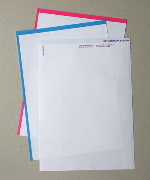
In collaboration with fellow student Luisa Heinrich, I designed a letterhead for the recently founded association Het Centraal Bureau. Gijs Müller, head of the asso, wanted to have something experimental for the new CO, which stands out from any regular letterhead (sure thing) with a little sex appeal.
The idea: We took his request quite literal and developed a customized sheet of paper which is just a little bit bigger than a regular A4 sheet but still fits into a regular laser printer. At first glance, the difference isn’t noticeable, but as soon as you file a HCB letter into a regular folder, the coloured frame and logo Het Centraal Bureau, which is printed in the area that’ll stick out due to its larger size. The frames are printed in two different colors, blue and red.
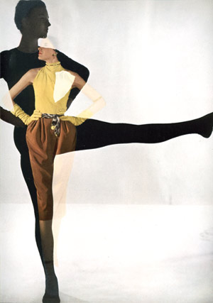
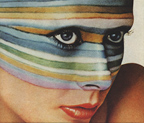
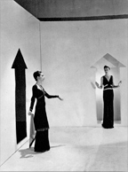
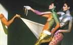
While I was working for the SFW (Sexy Fashion World) in Paris, I designed Phillippe’s portfolio. At that moment, he was becoming the fashion director of the Parisian magazine L’Officiel. I didn’t know him before but he is supposed to be or still is an important figure in the SFW. One part of his portfolio was just showing a huge collection of miscellaneous fashion photography to demonstrate his sense for style, fashion and taste. When everything was finished, I could keep the whole image collection, which was great. However, since I’m not attracted to traditional beauty anymore, it’s just taking too much space on my hard disk.
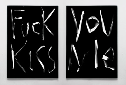
Fuck You Kiss Me is Eva Marie Rødbro’s graduation work. In June 2008 she asked me to design the book for her work.
I have to say, it was one of the most relaxing and easy going collaborations I ever had – except that Eva Marie was a bit nervous because it was her end exam. We understood each other from the beginning and we could proceed fruitfully and without any moody egoist bitching till the very end. I guess that’s how it should be!
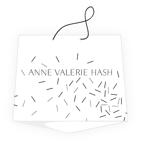
I had the pleasure to work on Anne Valerie Hash’s shopping bag.
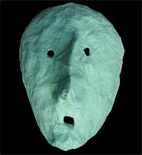
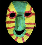
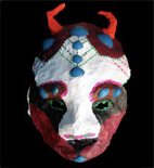
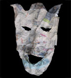
Once, me and my classmate Stefan Nauert organized a workshop (making masks out of paper) for homeless and drug addicted people in Amsterdam. We didn't do it because we were worried about our socially disadvantaged townsfolk. We did it as a school assignment supervised by Saskia Jansen.
In the beginning, it was hardcore to communicate with the homeless guys, not to mention working with them. Indeed, it was one of the weirdest and most difficult assignments I’ve ever got in my life. But it was really worth it. Of course, not because of the end result, but rather because of the things we went through.
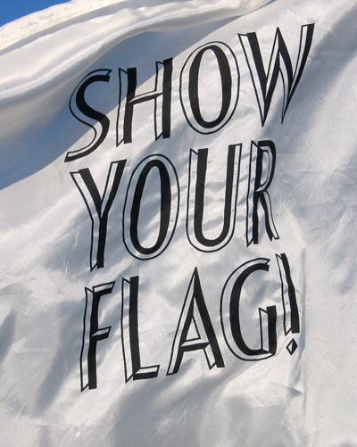
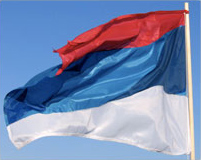
Nationality, an old-fashioned relict of the 20th century imperialism, has always been a source of endless fascination to me. Symbolic items like hymns, flags or any other obvious attribute are considered as pillars of an intact nationality. Especially the flag, which is one of the oldest abstractions, plays a major role in the presence of a nationality. An immediate recognition value and a strong symbolic meaning (at least that’s the intention) are transformed into simple color combinations and simplified shapes. However, due to the amount of countries and color combinations, it’s not a big surprise that many flags resemble each other.
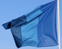
After residing in Paris for a while, which was followed by my immigration to Amsterdam, I noticed that my countries of residence (The Netherlands & France) and my country of origin Republic of Srpska (Serbian part of Bosnia & Herzegovina), have the same flag colors. It is funny (in a ridiculous way) that all of them are quite exchangeable and arbitrary, as soon as you change their angle of composition.
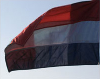
Thus, my idea was to create new flags, emerging out of those three flags and out of my own graphic principals: The first one is composed out of all three flags, which are sewed together. The second one only consists of the blue parts of each flag and the last one is a reply to the various light reflections on a flag. After a while I realized that all of a sudden, almost every artist with roots in Eastern Europe play with the same methodology. Damn, I wonder, is there something, which can be done without subconscious or conscious influence?! This assignment was initiated by designer Floor Kommen.
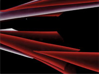
This is just a visual study (thus, no conceptual, profound or ideological approach). For the Open Day at the Rietveld Academie, each design student had to re-create one name from the graphic department. For this, we all were assigned one Photoshop filter, whose effect we then had to transform and work with in analogue reality. I was assigned the “lightning effects”.
To create the letters, I used different light-producing media like floodlight, cat’s eyes and a scanner. Here you see a typeface made out of golden easter egg foil, while the scanner was moving.
Sooner or later, a graphic designer will think of making a publication based on his own childhood, including traumatic events, hoping to obtain acceptance from it, which subconsciously works as therapy.
Well, a couple of years ago, I made a photo book dealing with the Yugo post-war struggle in relation to my own experiences. Probably, it even could have been a good publication (the subject isn’t that bad), but only if I would have skipped the personal view on it. Nowadays such egocentric publications simply run under the name of ‘fanzine’.
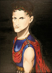
There aren’t really many parallels between Alexander the Great and me, except our names. Gary White, a frequent visitor to a homeless shelter who I became friends with, and who’s a big fan of the Renaissance paintings, saw more similarities in me and the great warrior. The painting was made by Gary, while he was giving me classes in traditional painting in one of Amsterdam’s homeless shelters. It’s showing me (quite identical), wearing an ancient armor plus a very serious and concerned expression on my face. I still wonder how he came up with the muscled body, that really isn’t me!
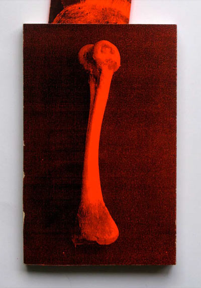
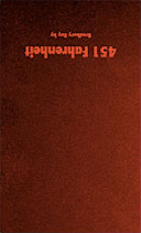
I guess everybody knows the story of Fahrenheit 451: a hedonistic and anti-intellectual society opposes books, the symbol for the source of knowledge and enlightenment. Referring to the plot, me and my colleague extraordinaire Aline Weyel redesigned the book and its chauvinistic ideas. We reversed the text, inverted the letters and printed everything on crude orange paper to hamper the reading. The cover shows a bone, bait for the hounds which are chasing the much hated folks who still own books.
The project was initiated by graphic designer Radim Peško as part of a collaborative project made at the Gerrit Rietveld Academie in 2008.